

Our Logo
OUR COMPANY MENU
ABOUT THE STORY
About Our Logo
E Ink’s heritage comes from both the rich history of paper making, as a pioneer of privately owned paper manufacturers in Taiwan, and the revolutionary, as the company who developed and commercialized the first successfully manufactured electrophoretic ink.
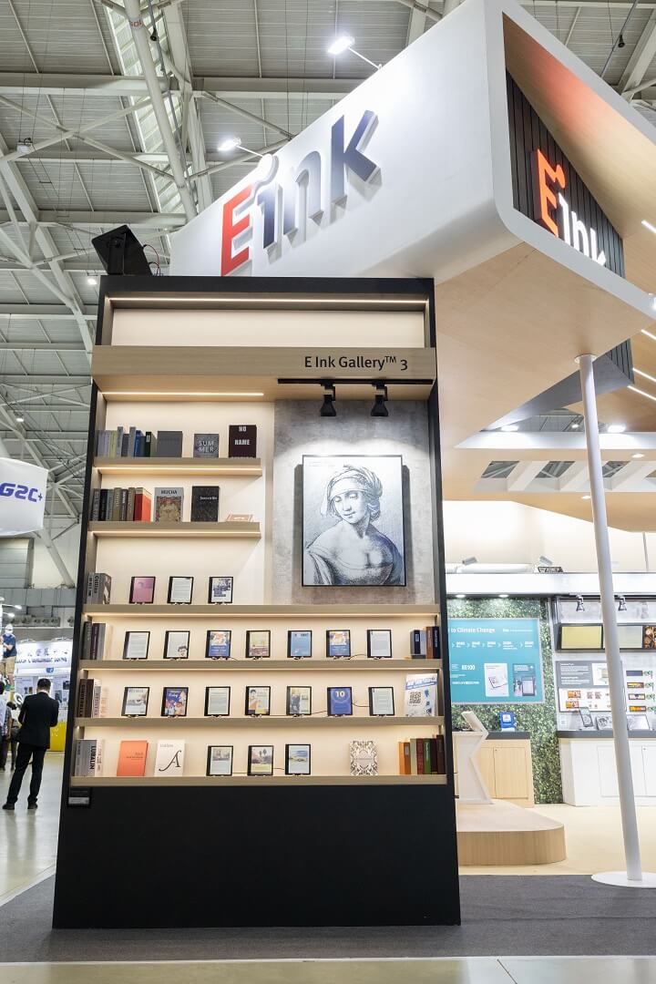
The E Ink logo uses "Duality" as our design theme. We embrace technological advances while respecting human life, human culture and human nature. E Ink emphasizes the cultural legacy passed on by technology.
The drop of ink on the top right of the "E" represents what writing means to cultural heritage. The connection of the ink drop and the "E" represent the merging of traditional printed text with electronic media.
The logo typeface is firm and steady representing the accuracy of technology. However, the corners are presented in an "analog-like" curve which is more human.
To help us continually offer you the best experience on our Website and help us manage it, E Ink Holdings Inc. and selected third parties will store some information on your computer or device using cookies to improve your navigation on this Website, help us understand traffic patterns and website visitor behavior and enhance website visitor experience. To find more about what cookies are, the ones on this Website and how to block or delete them,check out our Cookie Policy .
Decline
Accept
